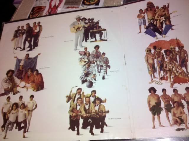
albums that depict the song titles in the artwork
PrimeCutsLtdPrimeCutsLtd jersey fresh 2,632 Posts
edited January 2011 in Strut Central
two off the top of my head

Jethro Tull - Warchild


Turtles - Battle of the Bands

there's got to be more no?

  Comments


  • strataspherestratasphere Blastin' the Nasty 1,035 Posts
    This one and those Super Hits comps put out by Atlantic/Atco are some good examples.
    Attached files

  • multiplication rock

  • minimini 880 Posts

  • dollar_bindollar_bin I heartily endorse this product and/or event 2,326 Posts

  • strataspherestratasphere Blastin' the Nasty 1,035 Posts
    dollar_bin said:


    Excellent choice.

  • dollar_bindollar_bin I heartily endorse this product and/or event 2,326 Posts
    I remember staring at my dad's copy of Cheap Thrills for hours when I was a kid. Sure, much of that was obsession over the depiction of nipples in the I Need A Man to Love panel. But also because it was the first example of R. Crumb's artwork I had ever seen and it was just so visually stimulating.

  • strataspherestratasphere Blastin' the Nasty 1,035 Posts
    Used this one in the numbers with covers thread. As I looked closer I noticed.........
    Attached files


  • pickwick33pickwick33 8,946 Posts
    stratasphere said:
    those Super Hits comps put out by Atlantic/Atco are some good examples.

    Atlantic used to work this format to DEATH:


  • batmonbatmon 27,574 Posts


    Around The World In A Day - Kid w/ the balloon
    Temptation - Red haired girl w/ the Ice cream cone
    Raspberry Beret - self explanatory
    America - little kid w/ flag
    Condition of The Heart - Old Man w/ cane
    The Ladder - in the middle/on the spine
    Tamborine - on the ground next to guitarist
    Pop Life - Old lady crying
    Paisley Park is the girl on the see-saw

  • dollar_bin said:
    I remember staring at my dad's copy of Cheap Thrills for hours when I was a kid. Sure, much of that was obsession over the depiction of nipples in the I Need A Man to Love panel. But also because it was the first example of R. Crumb's artwork I had ever seen and it was just so visually stimulating.

    Pretty sure the Crumb art work for that LP was supposed to be the back cover initially.


  • SunfadeSunfade 799 Posts

  • KineticKinetic 3,739 Posts

Sign In or Register to comment.