actual graphic designers, plaese to help a wannabe

The_Hook_UpThe_Hook_Up 8,182 Posts
edited April 2007 in Strut Central
I tried my bestest to make this look old...but it still has a heavy flavor of computer, so I was wondering if you pro dudes could hip me to something more I could do to take the digital aftertaste out...
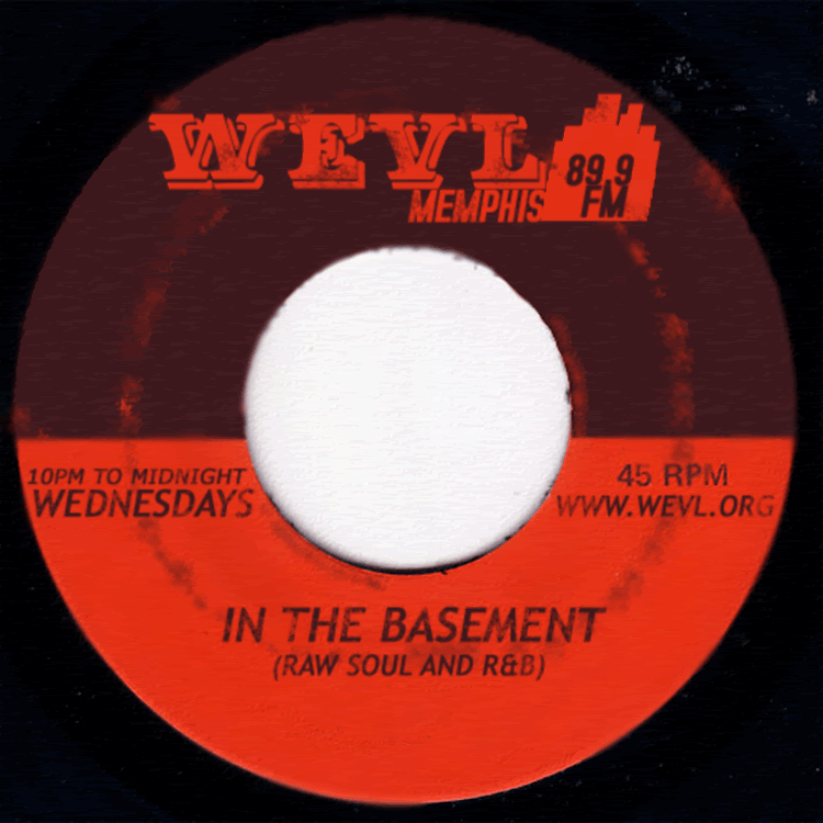
  Comments


  • PABLOPABLO 1,921 Posts
    Dude, that looks pretty damn good (i.e. authentically old/vintage/beat up/whatever).
    You probably just need to step away from it for awhile & come back with new eyes.
    Whatever you have to do to it, it ain't much.

    Edit: the centerhole needs cleaning up.
    IMG SRC=http://img256.imageshack.us/img256/3125/radioflyav1.gif>

  • DJ_ZestDJ_Zest 252 Posts
    Dude, that looks pretty damn good (i.e. authentically old/vintage/beat up/whatever).
    You probably just need to step away from it for awhile & come back with new eyes.
    Whatever you have to do to it, it ain't much.


    The only part I would change is maybe touch up inside top of the ring (right underneath "Memphis") on the white background that is a little smudged over, you might have to get down and dirty in the zoom, but it will look more solid...
    Not that I am pro designer, and it looks really good other wise, cool idea for a flyer...
    Are you rocking all 45s all night?
    Peace
    Zeb


  • cool idea for a flyer...

    http://www.soulstrut.com/ubbthreads/showflat.php?Cat=0&Number=854136&an=0&page=0#Post854136

    But I dig how you put the aging on yours.

  • masarumasaru 63 Posts
    The thing that makes it look a bit non-vintage is the type. It has a distinct post-Helvetica look to it (as in it's feels like something designed after Helvetica, and therefore a bit too modern). At least to me. If you want to look into that kind of thing, I would just try to use a typeface that was designed before 1970-ish. Even using Helvetica itself would give it more the feeling of san serif in the time period you are trying to conjure. But (and I could be wrong) the type you are using looks like a reaction to the Helvetica revolution.

    The worn effects look good to me, very authentic, and the ornate type at the top is very nice!

  • bennyboybennyboy 538 Posts
    I agree with Masuru, the type looks too new & too perfect; use something like trade gothic condensed or even helvetica condensed; & make it a little more imperfect, it would have been set up by hand, so a little imperfection gives a little authenticity. Also, kern that type, space the letters out a bit, that would work too.

  • The wear looks real nice, it's the sharpen/blur issues that I would want to touch up- thats what makes it look like someones been photoshopping. Loosing some of the resolution will help with that, you could also apply a real subtle half tone to the whole peice it might make it look more printed than say a scan of an actual 45, like it does now- but it would fix up those little digital looking blurs and sharper edges stuff and if it's just slight all your hard work at the wear will still come through.

  • hemolhemol 2,578 Posts
    The thing that makes it look a bit non-vintage is the type. It has a distinct post-Helvetica look to it (as in it's feels like something designed after Helvetica, and therefore a bit too modern). At least to me. If you want to look into that kind of thing, I would just try to use a typeface that was designed before 1970-ish. Even using Helvetica itself would give it more the feeling of san serif in the time period you are trying to conjure. But (and I could be wrong) the type you are using looks like a reaction to the Helvetica revolution.

    The worn effects look good to me, very authentic, and the ornate type at the top is very nice!

    True. Good insight. Also consider your analog options, as in printing it out un-effected messing it up, and then scanning it.

  • Overall feel of this is really good. Here's what I'd do...

    1. Choose a different typeface. Whatever italic face you're using there is waaaay too current and you'd never see it on a funk 45. Stick with Helvetica.

    2. The WEDNESDAY cluster of type on the left is too close to the borders. shrink it so it can breathe a little bit better.

    3. Try putting a very very slight blur on all of your type. This will help mesh it in with the label and look to be a part of the whole thing, VS floating type on top of a record label.

  • high_chigh_c 1,384 Posts

    1. typeface is waaaay too current

    from wikipedia:
    I>Trebuchet MS is a sans-serif typeface designed by Vincent Connare for the Microsoft Corporation in B>1996[/b]. It is named after the trebuchet, a medieval siege engine.[/i]

    Yo, I ain't buyin no 96 funk 45... you were probably going for that hotpie & candy look

  • The_Hook_UpThe_Hook_Up 8,182 Posts
    Thanks for the feedback guys...I figured I might have to change the type-face, but it took me so damn long to do what is shown...dang. Learning experience. I already rendered the type, so I would have to start over, right? Whats the name of the typeface used on the orange and black King label?

    I blurred the shit out of the type already...I blurred it again and it seemed too blurry. Should I just blur the edges of the letters with the blur tool and a not the whole layer with the blur filter?

    The label actually started with a scan of a Lanor label, I had a hard time rubber stamping the LANOR out, so I just deleted everything (except 45 rpm) and thought I would go for a Memphis label look, so I used the Bandstand U.S.A. label as a model...

  • PABLOPABLO 1,921 Posts
    You betta redo that shit son!
    I don't know anybody that would check a show/event with such suspect font selection in the flyer!
    Shit, my lil' nephew just walked by and took a look at the computer screen and blurted out "that font look hella 90's, that's not an actual record from the 60's!" and walked away in a huff.
Sign In or Register to comment.