Gospel Funk coming to Chicago / critique my poster
 luck
4,077 Posts
luck
4,077 Posts
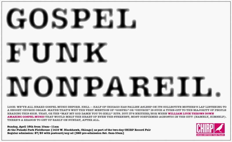 Plain as all get-out, but the genre alone (not common outside of collector cliques) should draw the eye amongst a bevy of colorful, glitzy rock posters at Reckless Records. Original size: 8.5x14[/b]As part of the Chicago Independent Radio Project Record Fair this 12th and 13th.
Comments
- Diego
The OG size is 8.5x14. Didn't want to blow it up and fuck with the page width here.
http://www.soulstrut.com/ubbthreads/showflat.php?Cat=0&Number=1084531&an=0&page=0#Post1084531
- spidey
I reckon you've got a top right-hand corner screaming out (fire'n'brimstone) for an image, a sign, some symbolism:
Just a place, is all. Got to cast the net widely. It was more of an mental image for visual space wars, if you know what I mean.
I figured that the text/message would dominate the top 2/3rds of the ad, and I'm all about using white space to free up the focal point. Working the heirerarchy.