Your Input is Appreciated! (CD cover poll related)
 soulmarcosa
4,296 Posts
soulmarcosa
4,296 Posts
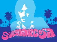
I'm working on a cover for a local bollywood cover band and we're almost there, designwise. These four options are very similar, but I'd be interested to see which one of these covers ya'll like the most. Holler.


Comments
Seriously, I think I prefer the top one.
The white "Mastana" is a must no mater what you go with, that black doesn't jump.
But this is my fave, and it all loks great. I need to have you do a flyer for our Wed nite!
Sho' nuff
By the way, does anyone know what that bollywood website is that had pictures of the Composers and their albums? I can't find it.
Thanks
Put this up in the mizzix
I AGREE.
this cover has the best color displacement, and its easier to read (ie the yellow text and blue people work well). However, I would like to see the slogan: 'bollywood and beyond'.
nice work.
the first one!
h
#1 says "Obscure heat!"
#4 says "Bangin!"
also i prefer "backroads to bollywood".
all look nice though.
I'd recommend changing the type size and layout of the BACKROADS TO BOLLYWOOD text at the bottom, as the word "bollywood" is really competing for airtime with "mastana." Since both of those words are calling for my attention at the same time at the same size and volume, I don't know which to look at first and the whole hierarchy is thrown off. If just "mastana" were big, I'd see it as more of the header it should be and the composition would flow really nicely. Mad flavor... heavy flow.
OPTION #1 - 6 votes
OPTION #2 - 0 votes
OPTION #3 - 7 votes
OPTION #4 - 8 votes
Which is interesting - the band and their "focus group" of friends and designers pretty much had settled on option #1 with some minor tweaks. Personally I like #3 & #4 the best, because of the textures and the "vintage postcard" look of the dancers. We'll probably replace the Taj Mahal with another building because it's a bit too obvious for an Indian theme.
I'm gonna forward this thread to the band so they can see your comments. Thanks again and here's a look at the original photo I took of the dancers (they're not officially part of the band, but usually accompany them onstage):
BTW the girl in orange in the center, Kriti, went to India last year and picked up some records for me, hooking me up for $5/each:
Though I would like to see the album title text straightened out
Lookin good though, M**k